My latest adventure in hand-lettering has me delving into the world of dipping pen calligraphy… here’s what I’ve learned so far.
Tips:
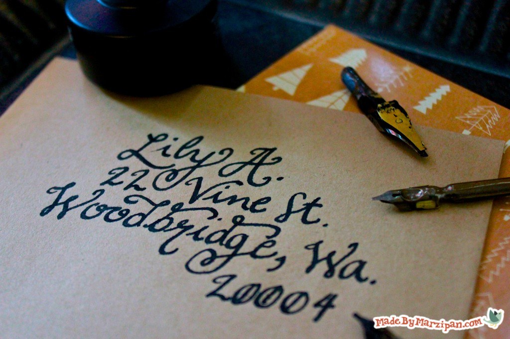
First a heads-up: this tutorial doesn’t cover traditional calligraphy (i.e., Gothic or Roman). That’s a fine art with rules that take years to master. Instead, I’ll show you a more playful script style that is popular for invitations and decor.
Picking Pens
If you go to your craft or art supply stores, you’ll see several varieties of calligraphy pens. Some are referred to as fountain pens, and come with cartridges or large reservoirs to hold ink. Although these can be fun to play with, they’re really more of a novelty item compared to traditional dipping pens. Fountain pens will severely limit your ink options, and are difficult to keep clean. The ink in these pens is rarely waterproof, and tend to fade over time.
So my suggestion is to skip those, and instead choose a nib holder with replaceable nibs. These are pretty inexpensive; you can buy a two pack of nibs for around $3, or a complete kit with several nibs for around $10. Most brands of nibs are interchangeable.
When you take a closer look, you’ll notice a metal plate on the back of the nib. This is the ink reservoir, which allows the nib to hold a bit of extra ink so you won’t have to re-ink as often. You’ll see that there are a lot of different sizes and types of nibs… some are very slightly slanted, and these are probably the easiest for getting started with script lettering. Finer nibs are best for small letters.
Choosing Ink
As far as ink goes, you can experiment with all sorts of mediums, such as acrylic with water, or watercolor paints. But my favorite is India ink, which is very dark and smooth. You can also buy calligraphy ink, but this is really better for those fountain pens we talked about, and it’s quite watery and pale. I recommend placing the bottle in a stable container to prevent tipping.
I realize this is called a dipping pen, but you’ll get better results if you refrain from dipping the whole nib in ink. Instead, use an eyedropper or a small paintbrush to place the ink inside the reservoir. This minimizes blotting and over-inking.
The key to calligraphy is maintaining the proper pen angle. Generally speaking, the nib should remain at the same angle throughout the entire process. To see what I mean, draw a clock. 3 o’clock is a straight 90 degree angle. I prefer to hold my pen at about a 30 degree angle, or somewhere around 4 o’clock.
2
Now let’s do some line practice. White cardstock works well for this; you can buy a large package for around $4 at Wal-Mart. For more important pieces, choose a stiffer paper, like Strathmore Bristol. Hold the pen at a 30 degree angle, and draw a series of 1’s and dashes. Whenever you make a vertical stroke, press down to increase the width of the line. Horizontal lines should lightly graze the paper. Keep writing until you begin to run out of ink. When you start to run out, the nib will feel scratchy against the paper, and become streaky.
3
Practice this a few times so you get a feel for how much ink your nib holds. It’s best if you can refill your nib right before it runs out of ink, but it takes awhile to get the hang of it. Take a closer look at your lines. If you’re holding the pen at the proper angle, the ends of the stroke will be slanted.
4
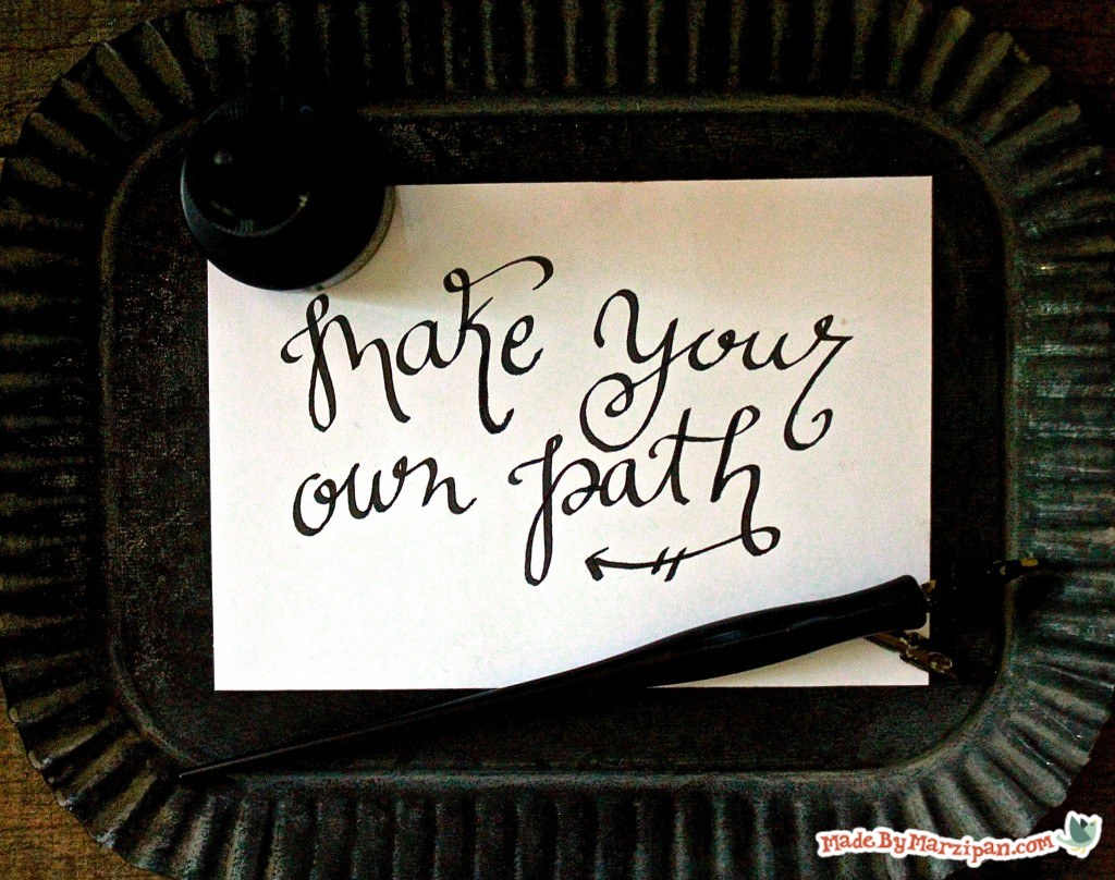
Now let’s make some curves with flourishes. Play around with the amount of pressure you apply until you achieve an effect you like.
5
Let’s try some letters. I came up with my own flourish-style alphabet that I’ve practiced and practiced until it feels as natural to me as my own handwriting. I’d encourage you to experiment with your own style, but if you’re welcome to practice with my alphabet. Click on the link above the “Made With” list to download a free Flourish Alphabet PDF that you can print and trace. (For best results, print on cardstock.)
6
When it comes to ascenders, or the tall lines, you can choose which direction you would like the flourish to extend. If the letter is at the beginning of the word, I’ll extend it to the right so it hangs over the word. If the letter is towards the back, I make it extend to the left.
7
Look for areas where crossbars (the horizontal strokes in the middle of some letters) might connect.
8
It adds interest when words interact with each other. For example, the “r” in the word “red” can descend and do double duty as the letter “l” in flash.
9
You may also want to experiment with variations in letter sizing and placement. The word “experiment” has a different vibe when it’s written straight and fairly uniform, than when it’s written in a more free and loose style.
10
When you’re finished writing, remember to always wash your nibs with water. If you happen to have ink that dried in a nib, you can buy a cleaner that will remove permanent ink, but water will do the job if you clean your nibs right away.
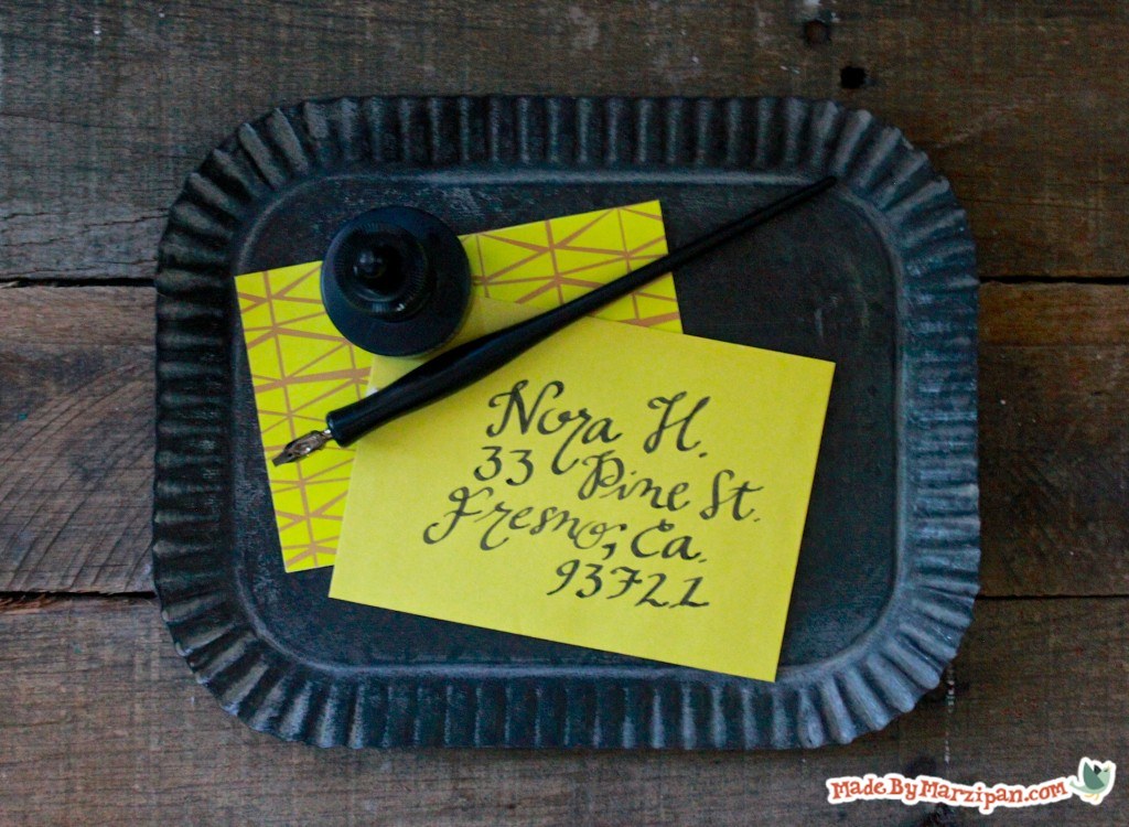
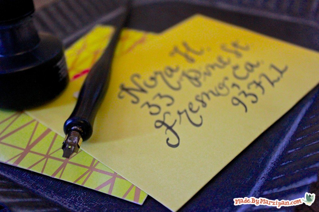
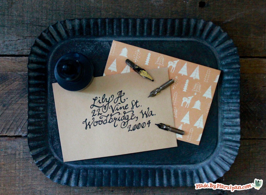
Script looks lovely on envelopes, announcements, and wall hangings. Hand lettering with dipping pens is an inexpensive and satisfying hobby. To see more hand-lettering samples, follow @madebymarzipan on Instagram.
Made By Marzipan may have received product or payment for this post. Posts may contain affiliate links. Disclosed in accordance with the Federal Trade Commission's 16 CFR, Part 255.
Finished? Show it off!
21 thoughts on “Intro to Dipping Pen Calligraphy”
kim says
hi! Thank you so much! You inspired me to practice more! Ive been up for hours while practicing! Id love to show you a pic of how I am doing!
:)
I want to thank you for your video. I bought some nibs to use with watercolour for fine details that are hard to control with a brush. I had no idea how to load the pen with the nib. Thank you for your generosity for the a clear concise and easy to understand video, perfect for a true beginner.
Hi there! I’m still a beginner to this kind of art and I’ve been finding an instructional calligraphy book or sheet online (since the physical books are too costly) and accidentally come across to your youtube account – leading me to your blog. Can I just say, that you are such a great help? I hope you could share more of your PDF soon because it goes a long way. Thank you and you are a blessing!
Calligraphy is a visual art related to writing. It is the design and execution of lettering with a broad tip instrument, dip pen, or brush , among other writing instruments.[1]:17 A contemporary calligraphic practice can be defined as, “the art of giving form to signs in an expressive, harmonious, and skillful manner”. Thanks for sharing
I came across your video on YouTube just now. I am so grateful. I’m going to find and follow you on Instagram. Thank you for the practical advice, I’ve been longing to find.
I recently got some nibs in to start practicing and I came across your video on youtube while looking for a “how to hold” tutorial. I’m noticing that both of my nibs are snagging the paper really easily. It’s just regular white cardstock. Do you think the nibs are too pointed? They look more pointed than the one you used in this video. Is there one you can recommend to get? I have the Tachikawa T-25 nib holder, I’m not sure if that matters. (Clearly a newbie)
Thank you, thank you, thank you! I am trying to develope a handwriting style to letter sentiments on the inside of my handmade cards and you tutorial using dipping pens is fantastic and I will try your method and lettering style as I find it lovely and then try adding my own slant to it.

 Finished?
hi! Thank you so much! You inspired me to practice more! Ive been up for hours while practicing! Id love to show you a pic of how I am doing!
:)
Thank you so much for sharing your lettering.
Hi!
Thanks so much for this! I’d love to see more!!
Lex
Hi Marzi,
I want to thank you for your video. I bought some nibs to use with watercolour for fine details that are hard to control with a brush. I had no idea how to load the pen with the nib. Thank you for your generosity for the a clear concise and easy to understand video, perfect for a true beginner.
Christine
Your lettering tutorials are wonderful! Thank you for sharing them and making it look so doable.
Love your videos! I’d love to practice your font with the pdf you talked about in the video, but I can’t find it anywhere. Is it still available?
Yes it’s on the right, where it says “Made With” by the supply list. Click on Flourish Alphabet PDF to download.
absolutely love all of your tutorials, videos, and artwork! you’re extremely clear and informative and have inspired me greatly!
Thank you!
Thanks so much, Hannah!
You are very easy to listen to.
Want to see if I can get the hang of you letters. Thank you!
Thanks for watching!
I appreciate that your tutorials are clear and easy to follow. Thanks for sharing your talent and helping the rest of us along!
Thanks for your feedback, Anna!
Hi there! I’m still a beginner to this kind of art and I’ve been finding an instructional calligraphy book or sheet online (since the physical books are too costly) and accidentally come across to your youtube account – leading me to your blog. Can I just say, that you are such a great help? I hope you could share more of your PDF soon because it goes a long way. Thank you and you are a blessing!
Hi Anne! I have lots more on the way. Check back to this page often to see new posts! http://www.madebymarzipan.com/?cat=606
Calligraphy is a visual art related to writing. It is the design and execution of lettering with a broad tip instrument, dip pen, or brush , among other writing instruments.[1]:17 A contemporary calligraphic practice can be defined as, “the art of giving form to signs in an expressive, harmonious, and skillful manner”. Thanks for sharing
I came across your video on YouTube just now. I am so grateful. I’m going to find and follow you on Instagram. Thank you for the practical advice, I’ve been longing to find.
I love you information on learning Calligraphy. You make it so easy to follow along with you. Thank you for all you lovely writting info.
Hey!
I recently got some nibs in to start practicing and I came across your video on youtube while looking for a “how to hold” tutorial. I’m noticing that both of my nibs are snagging the paper really easily. It’s just regular white cardstock. Do you think the nibs are too pointed? They look more pointed than the one you used in this video. Is there one you can recommend to get? I have the Tachikawa T-25 nib holder, I’m not sure if that matters. (Clearly a newbie)
Thanks so much!
Thank you, thank you, thank you! I am trying to develope a handwriting style to letter sentiments on the inside of my handmade cards and you tutorial using dipping pens is fantastic and I will try your method and lettering style as I find it lovely and then try adding my own slant to it.
Thank you for sharing the pdd. It would be great great help as I start using dip pens. 😊