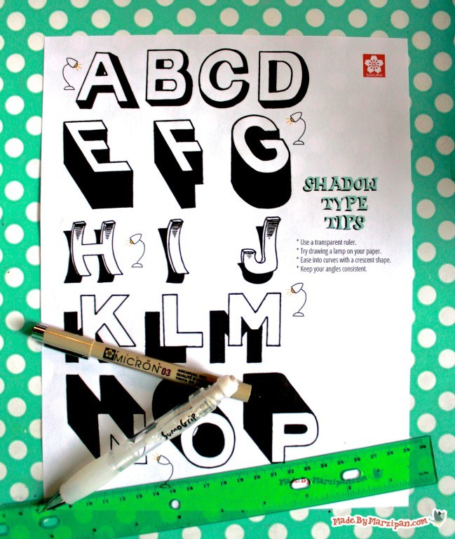
Foundational Shadow Type
1
Sketch out your letter with a pencil.
2
You may find it helpful to sketch a small lamp on your paper, to aid you in visualizing the direction of the light. For this first set of letters, the light will shine from the lefthand side of the paper. That means I’m going to add shadows to the righthand edges of the letter, as well as the bottom.
3
I’m drawing diagonal lines extending from each corner. Try to keep these angles consistent as you draw.
4
When drawing the shadow on a curved letter, ease into the curve with a crescent-shaped line, that widens at the center point, and narrows to blend into the letter at each end.
5
As you continue to draw, try to keep the width of your shadows consistent among each letter.
This style of shadow type is the foundation for other types of shading, so take time to familiarize yourself with it until it feels natural. Try sketching the lamp in another place, altering the direction of the shadows you draw.
Prone Shadow Type
Now let’s try something a little trickier. We’re going to draw 3D letters that look like they’re lying down.
1
Start by drawing a cap height guideline and a baseline. Then sketch a few diagonal lines from top to bottom, keeping the angle consistent. (Don’t worry too much about the spacing, we’re just going to use them as a reference and can always draw and erase lines as needed.)
2
Turn one of these diagonal lines into the main stem of the letter. The arms will stay straight along the top and bottom guidelines.
3
Starting at the bottom, extend the lines at the corners straight down. Do the same with the upper corners of the letter, then attach the two with a diagonal line that parallels the diagonal stem of the letter. Extend lines straight down from the corner of each arm as well.
Curled Shadow Type
Ready to step it up? Let’s try some curved letters that look as though they’re curling up off the paper.
1
For this H, draw two slightly curved stems. Keep the terminals straight. The crossbar should be straight as well.
2
Add a thin border along the left sides and tops of your lines to create the illusion of depth.
3
Move about a quarter inch down the stem of your letter, and curve your line in the opposite direction of your letter’s curves. End the line about a quarter inch past the bottom of the letter. (Don’t shade the crossbar at all, as this is where the letter is resting.)
4
Slightly shade the upper stem of the letter to emphasize the curves.
Offset Shadow Type
Let’s try something a little different, with an offset shadow. This type of shadow makes your letter appear to float above the page.
1
Space your shadow a slight distance away from the letter, placing the top of the shadow about a third of the way down the stem of the letter.
2
Draw an exact copy of the letter and shade it in.
Now that you have a grasp of how to draw shadows, you can experiment with placement, depth, and angles.
I like to ink my designs with a Pigma® Micron®pen. These come in a variety of colors and nib sizes. Continue to use your ruler as needed. Once your design is inked, erase the pencil marks.

 Finished?