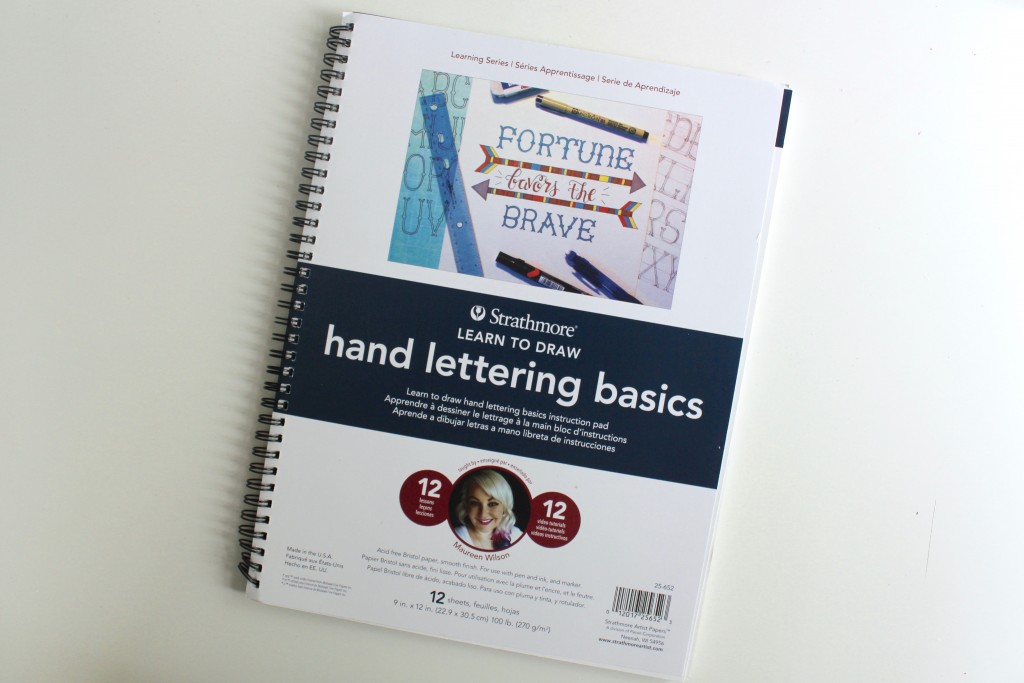
Learn how to hand letter in a faux calligraphy style. If you’re interested in learning 11 more lettering styles, check out my workbook, Hand Lettering Basics.
Tips:
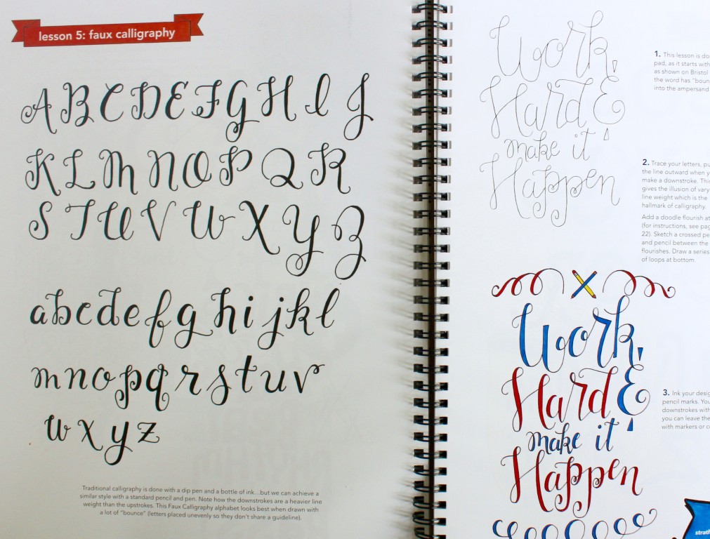
- Today I’ll demonstrate a Faux Calligraphy script. The signature of traditional calligraphy is varied line weights, with a thick downstroke and a hairline upstroke. We don’t need a dip pen or even a calligraphy marker to achieve this look.
How to:
1
Let’s start with a little practice. Faux Calligraphy differs from the other alphabets in this pad, as you start by writing the word, rather than sketching it. Begin by writing the word “joy” in a cursive script, using the alphabet in my Hand Lettering Basics pad as a guide.
2
Now re-trace your letters. Whenever you find yourself pulling the pencil in a downward direction, drag the line outward. As you reach the bottom of the downward stroke, narrow the gap between the two lines to close it off.
You can alter the entrance, exit, and connecting strokes, as well as the tails on your letterforms. You can also vary the height and width of letters within the word for a more spontaneous vibe. Try making the vowels smaller than the consonants.
For 11 more original lettering styles, check out my workbook, Hand Lettering Basics.
3
Finally, this lettering style looks best when it has some “bounce” to it. To help you see what I mean, I’m going to draw two base guidelines. As you write the word “joyous,” alternate which line the letters rest on. This gives your lettering a whimsical feel.
4
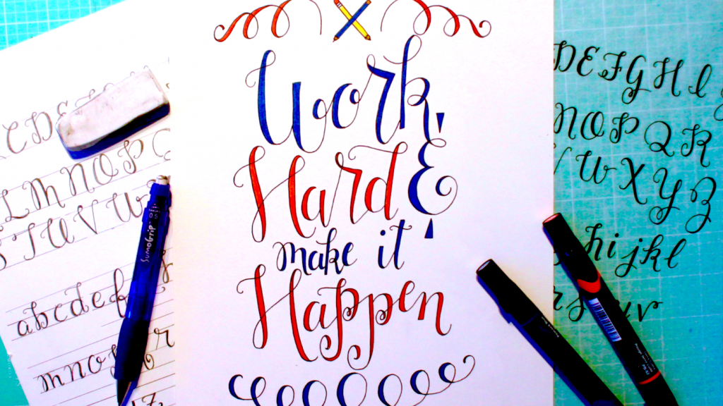
Let’s move on to our layout. Write, “Work Hard & Make It Happen.” I’m using Strathmore’s Bristol 200 series paper, which is the same paper included in the Hand Lettering Basics pad. You don’t need to be too fussy about sizing or spacing with this alphabet, but if something looks too off, go ahead and erase it and try again. That isn’t something you can do with traditional calligraphy, but it’s easy to fix with Faux Calligraphy.
5
I’m going to have the leg of my K loop into the ampersand below it. The words “make it” should have minor emphasis, so write those smaller. Note how my words are squished together, and how they bounce.
6
Widen the downstroke on your letters. My downstrokes are of medium width, but you can also make the gap between the two strokes very wide, to make it appear as though your letters were made with a brush or thick marker.
7
This design could use some accents. Mark the center point at top, then draw a pencil and pen crossing in an X. Actually, you can draw anything you’d like here, but I felt these were fitting since we’re working hard at hand lettering today.
8
Draw doodle flourishes on each side. I also have a lesson and video in this series on how to draw various flourishes, so be sure to check that out. Re-trace the flourishes and widen the downstroke as you did on the letters.
Add a series of loops at bottom.
9
Ink your design. You can fill in the gaps with your marker as you go, as I did on my alphabet guide. Or you can leave them empty and color them later, which is what I’m going to do for this design. I’m using a black Micron in size 05. Erase your pencil marks.
10
Color your layout if desired. You can use markers or colored pencils. Another technique that looks amazing, is to fill in your letters with your black Micron pen, then add an ombre watercolor wash to the background. Microns and watercolors pair well together, but if you’re using a different pen, be sure to test it with the watercolor on scratch paper first.
Made By Marzipan may have received product or payment for this post. Posts may contain affiliate links. Disclosed in accordance with the Federal Trade Commission's 16 CFR, Part 255.

 Finished?
Show it off!
