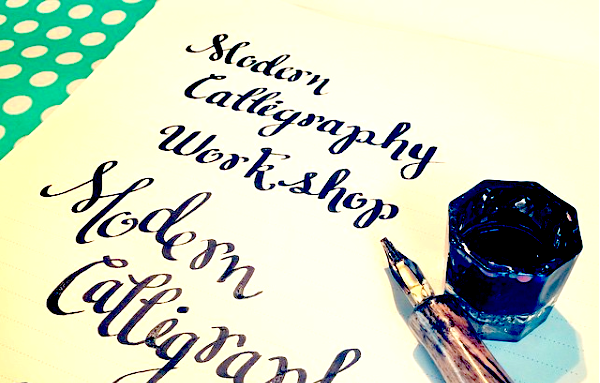
Unlike traditional calligraphy, which has many rules and can take years to master, modern calligraphy is about finding your own style and creating something fun and free-spirited.
Nibs
First, you’ll need a nib. Popular brands include Brause, Mitchell, and Speedball, among others. Some nibs have reservoirs, which are flat plates attached to the nib that hold extra ink when dipped. Sometimes these reservoirs are adjustable or removable. Others, particularly pointed nibs, have no reservoir at all. If you’re interested in buying nibs, I recommend checking out DickBlick.com. They have good descriptions of each nib’s attributes.
For beginners, I recommend Speedball’s C-Class Calligraphy Set, which costs around $10 and is available on Amazon and at many craft stores.
Brand new nibs have a protective coating on them that needs to be removed, as it repels ink. There are several methods for doing this, with the most common being to quickly wave a flame by the nib to burn off the coating. Please remember only an adult should use a lighter. Alternately, you can wipe it with acetone or even wash it gently with toothpaste using your finger. Be sure to rinse and dry well.
I’ll be using the C-4 nib. Slide the nib into the dip pen. When you insert a nib, try not to touch the point of the nib with your fingers, as this can leave oil on the nib.
Dip Pens
If you choose to buy a different dip pen, yours may have a metal insert instead. A common mistake is trying to insert the nib into the center of the hole. This will leave the nib extremely loose. The nib should actually be inserted along the interior side of the pen, wedged between the metal and the wood.
Some calligraphers prefer an oblique pen, which has an appendage for the nib. This can help you maintain a consistent angle when writing. However, I think a straight dip pen feels more natural for beginners. Dip pens can cost anywhere from a couple dollars to a few hundred. Serious calligraphers may decide to order a handmade dip pen, customized to their preferences. This pen was made by Jason from Farrell Woods, and features a fat barrel that I find more comfortable. However, my Speedball holder will work just fine for today.
Ink
There are many varieties of ink, including Winsor & Newton, Dr PH Martin’s, Higgins, and Speedball. I strongly prefer inks that are labeled “India ink,” rather than the more watery inks labeled with “drawing ink “ or “calligraphy ink.” I recommend trying Speedball’s Super Black India ink, which is available at most craft stores. Alternately, you can experiment with acrylics or watercolors, although these can be harder to control. Gently shake or stir your ink, as it can settle.
Optional Tools
There are a few other optional tools you may want to consider.
You may wish to buy nib cleaner, however, if you’re dedicated to cleaning your nibs immediately after use with water and then drying with a cotton rag, you shouldn’t need it.
You can dip straight from the bottle, but it can be hard to judge how far you need to dip, which can cause extra messes. I like to pour my ink into a dappen dish, which is a tiny jar most often used for manicures. You can purchase one for a couple of dollars from a beauty supply store. It’s just the right depth for dipping your nib. Alternately, some beginners like to use a paintbrush to drop the ink right into the resevoir.
It’s helpful to have some sort of pen rest. I picked this little dish up at a home goods store for a few dollars… I’m not sure if it’s an ash tray or if it’s for jewelry, but these notches work perfectly for holding an inked pen.
Some calligraphers prefer a sloped writing surface. A binder works well for this. However, I prefer to work on a flat surface, cushioned slightly by either a cutting mat or the paper pad.
Paper
The paper you choose will make an immense difference to the appearance of your calligraphy. Notebook or printer paper will cause the nib to snag, and small paper fibers will get caught in the nib.
I really like Strathmore’s line of Writing papers. They have lined and blank pads. The paper is just thick enough to keep the ink from bleeding through, and I had zero issues with ink feathering. Alternately, you can use Strathmore’s Bristol paper, which is a heavier weight and ultra smooth.
Getting Started
Let’s start with a C-3 or a C-4 nib. Let’s take a close look at how the nib works. Place the uninked tip of the nib against the paper, then apply pressure while drawing downward. With the C-3 and C-4 nib, you can see three separate tines. As you release the pressure, the gaps between the tines narrow and then close. This creates the variation in stroke widths that are the hallmark of calligraphy.
Prepare your work space with your paper, ink, and a piece of scratch paper. Use the same type of paper for both your project and scratch paper; you don’t want to get fibers in your nib from cheap scratch paper.
Dip your pen in the ink. You’ll want to cover the nib about halfway, filling the reservoir. Wipe the excess ink on the side of the jar. Make a couple of test lines on the scratch paper to make sure the ink is flowing smoothly and isn’t puddling.
We’re going to do a few drills. Draw a series of vertical lines on your paper. You want hold the nib to the paper somewhere between a 30 and 45 degree angle. Perhaps the easiest way to visualize this is to imagine the handle of your pen as the hour hand on a clock. You’ll want your holder to align at approximately 4:00. You can play around with the angle to achieve different results, but you’ll want to keep it consistent throughout your writing.
Practice making the lines straight and of a consistent width. Get a feel for how much writing you can do before you need to re-ink.
Now try crossing the lines horizontally to make a row of t’s. Don’t apply any pressure when writing horizontally, aim for a thin, straight stroke.
Next try some curved lines. Whenever you are pulling the pen downward, apply pressure to thicken the line.
Finally, practice circles. Draw these in two parts, starting the stroke at the center top and meeting in the center bottom. Again, remember to apply pressure when pulling downward, and release as you reach the end of the stroke.
Writing Letters
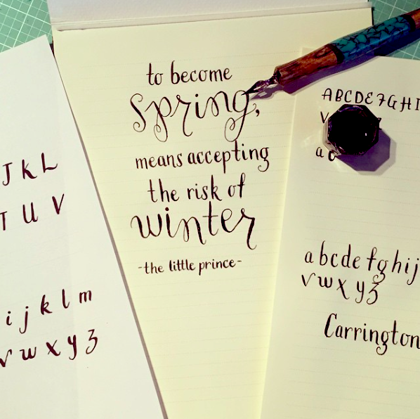
There are endless variations of lettering styles in modern calligraphy, and of course you can experiment and create your own. However, I’ve created this printable guide for my Dahlia Alphabet if you’d like a good place to start (click on the link above the supply list to download).
Start by lightly tracing the letters with an uninked pen, to familiarize yourself with the strokes. Remember to test your inked pen on scratch paper. Right now I’m using Strathmore’s lined writing paper.
When spacing your letters, allow a total of 4 lines per row of text. The body of capital letters (majuscules) will take up two lines, with descenders extending down into the fourth line.
The body of the lower case letters (minuscules), will sit on the second line, with ascenders extending upward to the first line, and descenders going down two lines.
Remember that you are trying to keep the nib’s angle consistent. This means that there should be very little movement in your wrist as you write.
if you need to re-ink mid-letter, overlap the stroke where you left off for a smoother line.
Keep the pen moving as you write. Pausing mid-stroke can cause the ink to puddle, and hesitation will create wobbly lines.
Don’t worry if it feels like you’re making a lot of mistakes at first. It happens to everyone!
Mistakes do happen, which is why I like to always start with an alphabet drill like this before working on an actual piece. Practicing calligraphy will help to establish muscle memory, and after a while you’ll be able to write without thinking too much about it.
As you write, make an effort to keep your loops open. If you have too much ink on your nib, they can close, like on this u.
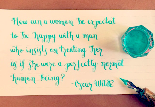
Now try putting it all together to write words. With modern calligraphy, there’s no need to try to keep your letters evenly sized or in a straight line. Pretty much anything goes, as long as it’s aesthetically pleasing.
I’m going to switch to the 512 pointed nib that’s included with Speedball’s calligraphy set. This nib is ideal for smaller, more deli cate writing. Because it’s narrower and only has two tines, you can achieve fine hairlines, and your shades will be more obvious. With these fine nibs, the ink has a tendency to pool when you make cross strokes, so you may wish to lift your pen when drawing a cross stroke, and continue the line on the other side of the main stroke.
I’m using FW Pearlescent acrylic ink. Acrylics dry more quickly on your nib, even during use, so you may need to stop and clean it.
Clean Up
It’s important to clean up immediately after you’re finished. Unused ink can go back in the bottle. Wash the nib and dappen dish throughly under running water, then dry immediately with a cotton rag.
Try modern calligraphy on envelopes, place holders, wrapping paper, and wall hangings!

 Finished?
Show it off!
