This online handlettering workshop was create in collaboration with Strathmore Arts. It’s my longest and most in-depth tutorial ever filmed!
The number on the pen corresponds with the nib size; the larger the number, the bigger the nib. If you’re just starting out and only buy one single pen, I recommend buying a black 05, which has a .45 mm nib.
The very best paper I’ve found for lettering is Bristol paper, made by Strathmore. This paper is incredibly smooth, without being glossy. Its heavy weight holds up well to erasing and won’t crumple. Bristol paper is acid-free, so your artwork will last for a long time.
So while you can certainly write on just about anything, if you’re serious about creating a polished handettered piece, I’d recommend choosing Strathmore Bristol paper.
Letter Practice
Guidelines can assist you in creating balanced, uniform letters. I like to draw a cap height guideline, which the capital letters and ascenders will touch; as well as a baseline, where the letters will sit. You can add other guidelines as needed, such as an x-height guideline where the top of lower case letters will touch. You may also wish to draw a descender guideline where descending tails will touch.
We’ll begin by practicing one of the easiest letters, T. As I work, I’ll refer to different elements of the letters. I don’t have enough time to cover all of the terminology in this video, but I’ve created a free PDF for you to print as a reference (link located above supply list).
Let’s start with a simple sans serif block letter. As you draw, you’ll want to pay attention to keeping your line widths consistent.
Now let’s try one with decorative serifs. I’ve had to speed up the footage so I can cover more information, but go ahead and take your time. Remember, you’re not writing letters, you’re sketching them.
Now let’s try rounding off the terminals.
You can add slab serifs, rounded serifs, or ball serifs.
Try a curvy brush or script-style letter.
The final T will feature splayed terminals.
If you’re looking for ideas for lettering styles, one of my favorite sites is Myfonts.com. These are mostly designer fonts you have to pay to download, however, there’s no need to download them since we’re only using them as an inspirational starting point for our drawing. If you register for an account, you can create albums to save your favorite fonts to reference later.
Adding Ink
Once your letter is sketched, it’s time to ink it. Go over your pencil lines with a pen, using the ruler as needed.
You can add character to your letters by adding further embellishment. You can turn block lettering into prism style lettering. There’s a tutorial on my website that covers this technique in depth. You can add dots, or draw inline. Consider adding shadows, or filling with a pattern or solid color. (Click here for a tutorial on Hand lettered Shadow Type.)
Tricky Letters
Now that we’ve practiced some different styles with an easy letter, I’m going to share a few tips for the trickier letters. For letters with multiple stems, like N, M, and H, I like to start by drawing all the stems first. To draw the connecting leg on the N, draw a line from the top right corner to the bottom right corner on the opposite stem. Then draw a line from the top left corner to the bottom left corner.
When it comes to the letter O, I draw short lines for the right and left sides. Then I connect these with curves at the top and bottom. Repeat to create the bowl.
I think that S is the most difficult letter! I’ve found it’s easiest to draw two short lines, one near the top and one near the bottom. Repeat on the right side. Turn these lines into curves. Sketch out the correlating line. Then connect the top and bottom lines with a curve in the middle.
Finally, let’s try an E. I like to draw a rectangle for this, then draw the top and bottom arms to extend the width of the rectangle. Then center the middle arm in the space between. Shorten the middle arm by about ⅓.
Planning A Layout
There are a few key elements to consider when designing a hand lettered layout.
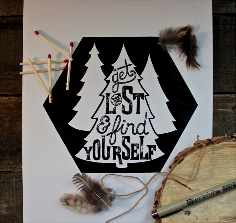
Make a few thumbnail sketches to give yourself a starting point. I’m going to letter the words, “get lost and find yourself.” I thought a bear might be cool, but then realized I wouldn’t want to run into a bear while lost. So instead I’m opting for a tree design.
Sketching A Layout
I think a hexagon would make a cool frame. I’m making each side 3.75 inches long. Then I’m adding a triangle in the center. Turn it into a pine tree by sketching points for branches.
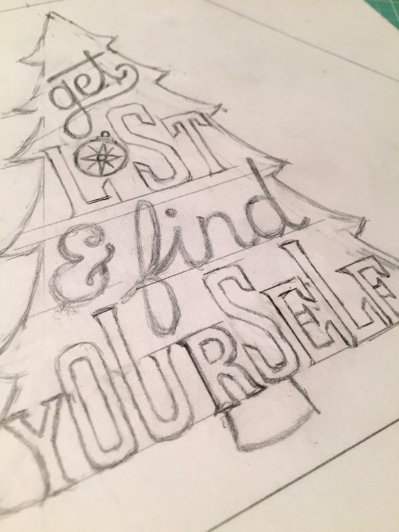
I often start my designs in the center, but I think it will be easiest to start at the bottom with a triangle. Find the center point of the word you’re writing, and draw the letters outward from that point to make your word balanced. Draw guidelines and use your ruler as needed.
Now I’m going to move to the top so it will be easier to center the remaining words in the middle. I’m drawing a cursive script for this. Sometimes I like to wait to finish off the descenders and ascenders until I see whether there’s a way to utilize them to enhance to the design. Don’t hesitate to turn your paper if it gives you a better angle for drawing.
As I’m drawing the word “lost,” I realize that the “o” could pull double duty as a compass, which would contribute to the mood of the piece. During this sketching stage, everything is very fluid. Don’t be afraid to make changes and deviate from your thumbnail sketch as the design comes together.
I love to replace the word “and” with an ampersand; there are endless style variations and it can be a beautiful design element.
I’m bothered by this white space, so I’m going to lengthen some of these letters to balance it out. Since I did that to this word, I’m going to mirror it in the word “lost.”
Now let’s do a quick check of our four key elements.
Inking
Once you’re happy with your design, it’s time to ink it! Slowly trace your design. I’m giving my letters a distressed finish by stippling some areas. Take it slow, and don’t hesitate to stop and turn the paper if it gives you a better angle for tracing.
After you’ve traced your design, wait a minute or so to ensure the ink is completely set, then erase your pencil marks.
Check your overall design and see whether it’s missing anything. Sometimes filling in the background can make your piece pop. You can use a regular marker for this, since you’ve already erased your pencil marks. You may want to add shadows or maybe embellishments. Check out Hand Lettering Accents for more ideas.
This piece is finished! I hope you enjoyed learning a little about the handlettering process. Need more inspiration? Check out 30 Days of Handlettering.

 Finished?
Show it off!

I’ve looked high and low for a really good tutorial – this one is EXCELLENT. I learned more tips and tricks in this video than in all the others combined. Thank you so much! You are very talented – not only in lettering, but in teaching as well.
Marzi you are amazing! Thank you for all the great info, tips and teachings! Wishing you much success!!
IM LOST AND DON’T KNOW MY WAY BACK……help please