Learn modern calligraphy with this free printable guide.
Tips:
1
The paper you use for calligraphy makes a big difference. Notebook paper and copy paper tend to snag and get small fibers in your nib. The ink can also feather and bleed. I like to use papers from Strathmore’s Writing Series. Alternately, Bristol smooth paper is a good choice, although it is unlined.
2
You’ll also need a dip pen and nib. I’ll be using a custom made nib holder with a Speedball C-2 nib. However, any holder is fine, and you can experiment with different nibs to achieve different styles.
3
I recommend India ink for beginners, and the brand doesn’t make much of a difference. You can also experiment with acrylic inks or watercolors, but it can be a little trickier to achieve the results you want as a beginner.
4
I like to pour my ink in a tiny dappen dish, because it’s the perfect depth for dipping and doesn’t tip over easily. You can find these for a couple dollars at a beauty supply store.
How to:
1
Fold a piece of scratch paper and place it nearby. (It’s important that you use a quality piece of paper for this, as cheap paper will get caught in your nib.)
2 Dip your nib into the ink, wipe excess ink on the side of the dish, and make a stroke on the scratch paper to reduce the chance of puddling on your work.
3
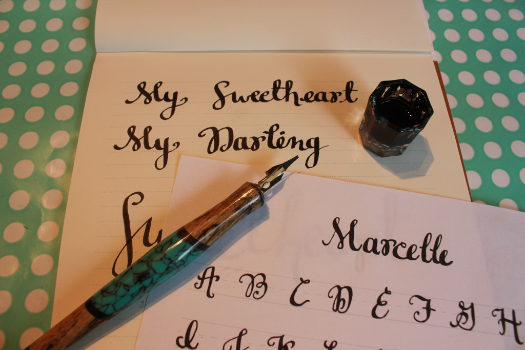
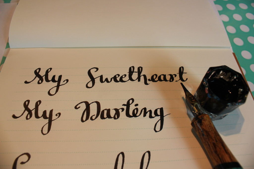
Use the “Marcelle” guide to draw your letters. When you draw your pen upward, lightly touch the nib to the paper. When drawing downward, press firmly to open the tines of the nib and create a thick shade.
4
My capital letters are taking up two lines, with descenders dipping down into the third.
5
Some of these letters end with a curl. For those that don’t, such as J and S, end the stroke with a flicking motion, snapping the nib quickly off the page.
6
If you run out of ink mid-stroke, dip your pen and then re-trace the beginning of the stroke to achieve a smooth line.
7
The lower case letters for Marcelle should look pretty familiar and most will come naturally to you. For the letters i and r, leave an open loop.
8
The letter k is a little tricky because it starts at top right and pulls left before drawing downward.
9
Lower-case m has one tall bump and one smaller bump, as does w.
10
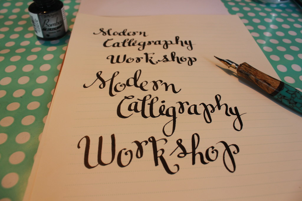
You can achieve different moods with this lettering style by adjusting the spacing and placement. With modern calligraphy, there are no rules about keeping the letters a consistent size. So feel free to experiment with what you like best.
11
When you’re finished, return the unused ink to the bottle, and clean your nib with water. Remember to dry it thoroughly with a cotton rag to prevent rust.
Made By Marzipan may have received product or payment for this post. Posts may contain affiliate links. Disclosed in accordance with the Federal Trade Commission's 16 CFR, Part 255.

 Finished?
Show it off!
Thank you, Marzi. Great style!
Thank you!
Sooooooo exciting
Love your awesome style! I am totally inspired to create!
Thank you!
I am absolutely amazed ! Love your style – can’t wait to try it out!